


How to Choose Restaurant Upholstery Colors That Look Good for Years
09:02 | Fri | 30 October 2026
How to Choose Restaurant Upholstery Colors That Look Good for Years
Updated October 2026 · By the BESeating team — manufacturing commercial seating since 1993
Quick answer: Choose restaurant upholstery colors by concept, traffic and cleaning: mid-tone and darker shades such as cognac, olive, navy, charcoal and terracotta hide wear best; lighter colors suit low-traffic, premium rooms. Pair upholstery with your wood stain and floor, use one or two accent colors, and test swatches under your actual lighting before ordering.
Upholstery is one of the largest color surfaces in a dining room, so restaurant upholstery colors shape the mood as much as paint or lighting. The right choice also hides daily wear and stays on-trend for years. This guide covers palettes, practical shades, pairings with wood and how to test swatches.

Arizona commercial vinyls: View the vinyl range
Key takeaways
- Mid-tone and darker colors hide stains, scuffs and wear far better than very light shades.
- Start from the concept and lighting, then pair upholstery with wood stain, floor and walls.
- Use one main seating color and at most one or two accents to keep the room calm and easy to reorder.
- Always test physical swatches in your room, under evening lighting, with your cleaning products.
1) Why do upholstery colors matter so much in a restaurant?
Chairs, booths and bar stools can cover a large share of what guests see at eye level. A strong upholstery color can make a room feel energetic, cozy or formal, and it shows up in every photo guests post. Color also affects maintenance: some shades show every crumb and water mark, while others look clean after a busy Saturday.
Because seating usually stays in service for many years, choose colors that fit the concept long-term rather than a short-lived trend.
2) Which colors hide stains and wear best?
| Color group | Hides wear | Mood | Watch for |
|---|---|---|---|
| --- | --- | --- | --- |
| Charcoal, graphite, black | Excellent | Modern, formal | Can feel heavy in dark rooms; shows dust and lint |
| Cognac, tan, caramel | Very good | Warm, classic | Pair carefully with orange-toned woods |
| Navy, ink blue | Very good | Calm, upscale | Needs warm lighting to avoid feeling cold |
| Olive, forest green | Very good | Natural, relaxed | Check under evening light |
| Terracotta, rust | Good | Warm, Mediterranean | Can dominate small rooms |
| Cream, white, light gray | Weak | Light, airy | Shows stains, denim transfer and scuffs |
For busy restaurants, mid-tone and darker colors are the safest. Light colors work best in low-traffic or premium zones where guests are seated by staff and seats are cleaned carefully.

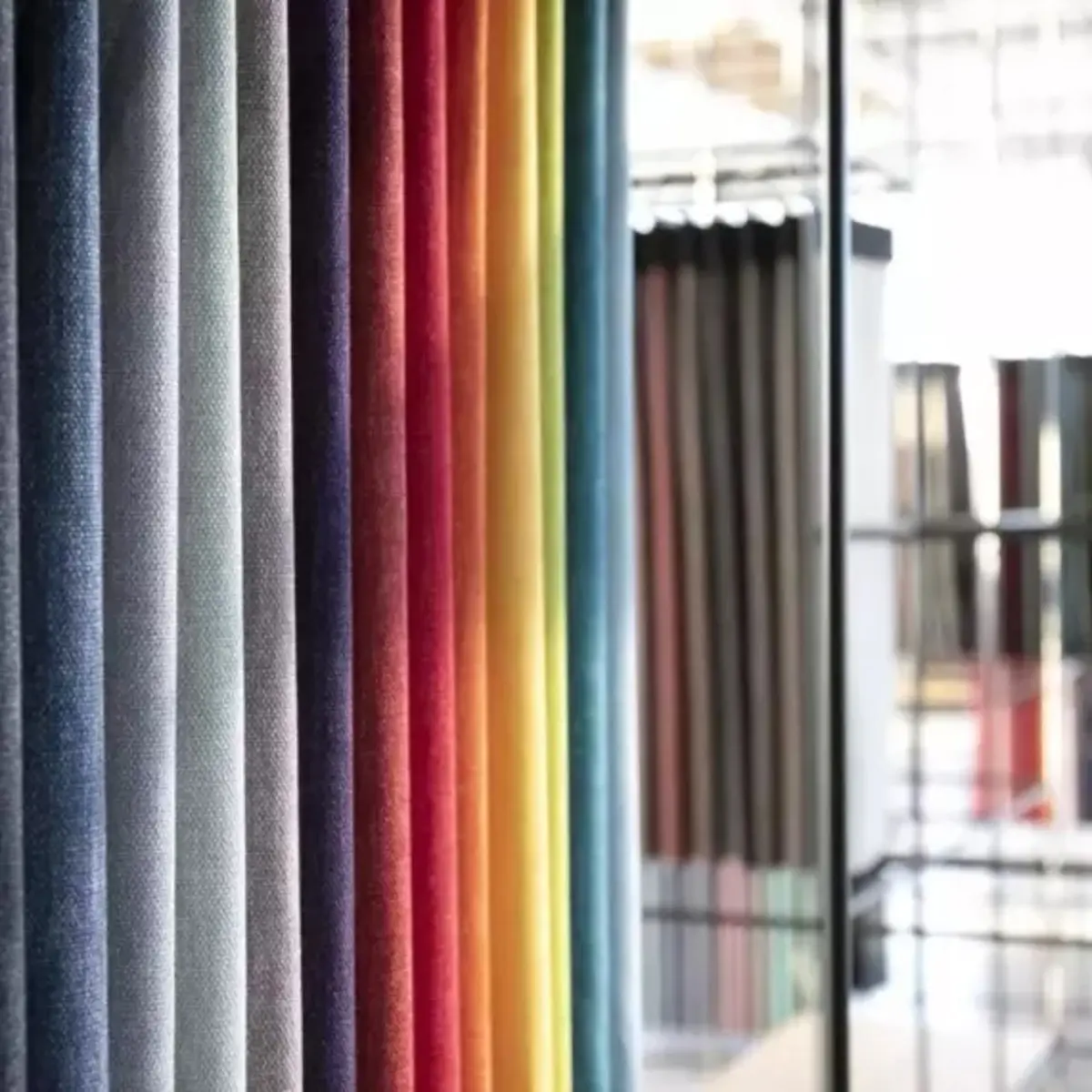
Colors and upholstery options: View colors and upholstery
3) How do you choose colors by restaurant concept?
Café and bakery
Soft greens, mustard, dusty blue or warm tan with light oak or natural beech create a fresh, welcoming feel.
Casual and family dining
Durable mid-tones such as cognac, navy or terracotta hide wear from high turnover and kids.
Fine dining and steakhouse
Deep tones such as oxblood, espresso, charcoal or forest green feel rich with dark stains and warm lighting. See our steakhouse and fine dining guidance.
Bars and pubs
Black, oxblood, cognac and bottle green suit low lighting and long evenings. Our bar and pub furniture guide covers stools and booths.
4) How should upholstery match wood stains?
Upholstery and wood work as a pair. A few combinations that work in many rooms:
| Wood stain | Upholstery that works | Effect |
|---|---|---|
| --- | --- | --- |
| Natural or light oak | Olive, navy, mustard, light gray | Fresh, Scandinavian |
| Walnut or medium brown | Cognac, green, cream, blue | Warm, mid-century |
| Espresso or black | Oxblood, camel, charcoal, teal | Bold, upscale |
| Gray-washed wood | Charcoal, blush, slate blue | Soft, contemporary |
Custom stain matching helps you align chairs with existing floors and millwork. Browse wood stain options alongside upholstery swatches so you choose both together.
5) Should you use one color or several?
Most successful rooms use one main seating color and one or two accents. For example: cognac chairs throughout, with deep green booths along one wall. Too many colors can make a room feel busy and complicate reorders, because every color needs its own spares and future matching.
A useful rule is to keep the main color on the item you have the most of, usually chairs, and use the accent on booths, banquettes or bar stools.

Pandora fully upholstered chairs: View the installation
6) Does color choice differ for vinyl and fabric?
Commercial vinyl usually comes in clear, consistent colors and wipes clean easily, so it suits mid and light tones better than fabric does in busy rooms. Fabric adds texture and depth; patterns and heathered weaves hide wear better than flat solid colors. For a deeper comparison, read upholstered vs wood seat restaurant chairs.
7) How do lighting and walls change upholstery color?
Warm evening lighting shifts colors toward yellow and red, which can make navy look almost black and cream look beige. Daylight from large windows shows true color. Always look at swatches at the times you are busiest, next to your wall color and floor, because a color that looks perfect in a showroom can read very differently in your room.
8) How do upholstery colors affect booths and bar stools?
Booths are large blocks of color, so a bold shade on a booth has more visual weight than the same color on a chair. If you want a strong statement, booths are the place for it; keep chairs in a supporting tone. Bar stools are seen from the whole room, so they often match or contrast the bar front.

Brazil chairs and bar stools with Pandora chairs: View the installation
Browse restaurant booths and bar stools to see how colors work on different shapes.
9) How do you test upholstery color before ordering?
- Shortlist three to five colors that fit the concept.
- Order physical swatches and a wood stain sample.
- View them in the room at lunch and dinner lighting.
- Wipe them with your daily cleaning products and check for marks.
- Confirm the final color codes in writing with the order.
BESeating provides samples for all products, including fabric and vinyl swatches, and offers a wide range of commercial vinyls and fabrics.
Final recommendation
Choose restaurant upholstery colors in mid-tone and darker shades for busy rooms, pair them deliberately with your wood stain, and limit the palette to one main color plus one or two accents. Save light colors for calmer, premium areas, and always approve physical swatches in your own lighting before production.
Next step: browse colors and upholstery and restaurant chairs, order swatches, or contact BESeating to match colors to your concept.
FAQ: Restaurant upholstery colors
What is the most practical upholstery color for a restaurant?
Mid-tone and darker colors such as charcoal, cognac, navy and olive are the most practical because they hide spills, scuffs and daily wear. They also suit most wood stains. Very light colors look fresh at first but need more careful cleaning and often show marks within months in busy rooms.
Are white or cream restaurant chairs a bad idea?
Not always, but they need the right setting. White or cream upholstery works in low-traffic, premium rooms with careful cleaning and commercial vinyl that wipes easily. In busy casual restaurants, light colors tend to show stains and denim transfer, so mid-tone shades are a safer long-term choice.
How many upholstery colors should a restaurant use?
Most restaurants look best with one main seating color and one or two accents, for example chairs in one tone and booths in another. A limited palette keeps the room cohesive, makes reorders simpler and reduces the number of spare materials you need to keep for repairs.
Should booth and chair upholstery match?
They do not have to match, but they should coordinate. Many rooms use a bold color on booths and a supporting tone on chairs, or the same color in different textures. Test swatches of both together next to your wood stain and floor before confirming the order.
Can I see upholstery colors before ordering?
Yes. Order physical swatches of the vinyls or fabrics you are considering, along with a stain sample, and view them in your room under real lighting. BESeating offers samples for all products, including fabric and vinyl swatches, so you can confirm colors before production.



Be Seating 2010 - 2026 All rights reserved ©
Request a quote
CloseName
Phone
Company name
Industry type
Country
Notes
Please enter the result below
I agree with....
Wrong verification code.
All fields are mandatory
Thank you for your message! We will come back to you shortly.